Competitiveness
The Competitiveness sub-module shows YoY evolution for the subscribed airlines' key metrics i.e. Average Fare Per Passenger and Redirects. These are displayed as a comparison to other airlines for a given selected route and travel period.
The Searches key metric displays overall market search numbers for a given route and travel period.
Exploring Key Metrics

Average Fare Per Passenger
| Displays the subscribed airlines' average fare per passenger in USD for the selected route and travel month(s). It is based on travellers' redirects made in the last 12 months. | 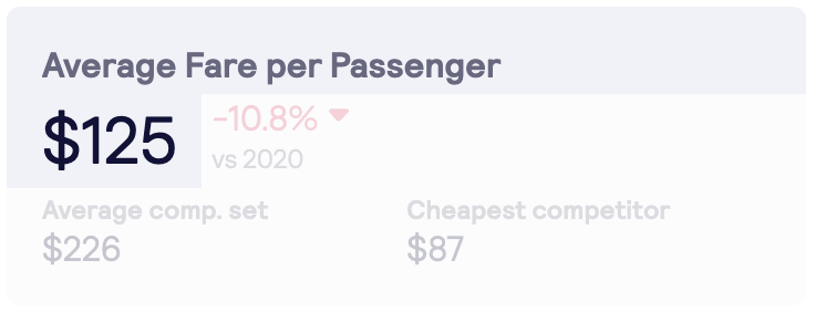 |
|
|
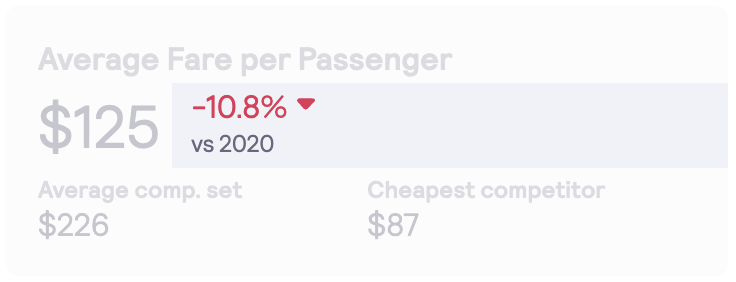
Any percentage change in the subscribed airlines' average fare per passenger from last year displays as an increase or decrease and is represented by an up or down arrow and colour. Red symbolises a decrease and green, an increase. |
 |
|
|
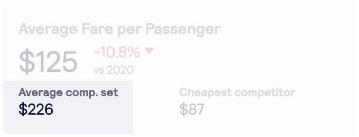
Average Competitor set displays the average fare per passenger of other competing airlines displayed in USD for the same search query, based on travellers' redirects made in the last 12 months. If there are no other competitors that meet search criteria, a '-' symbol is displayed. |
 |
|
|
|
||
|
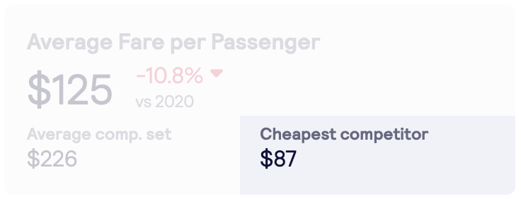
Cheapest Competitor displays the average fare per passenger of a competitor airline with the lowest average fare per passenger, displayed in USD. If there are no cheapest competitors or the subscribed airline is cheapest, then a '-' symbol is displayed. |
 |
Searches
| Total Searches on Skyscanner for the selected route and travel month(s), based on travellers' searches made in the last 12 months. | 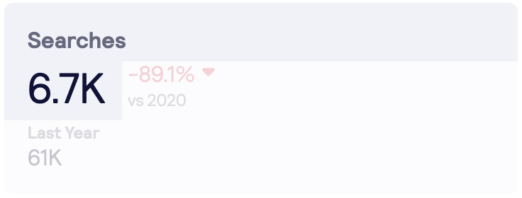 |
|
|
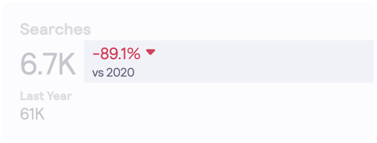
Any percentage change in total searches from last year displays as an increase or decrease and is represented by an up or down arrow and colour. Red symbolises a decrease and green, an increase. |
 |
|
|
|
||
|
Last Year displays the total searches on Skyscanner for the selected route and travel month(s), based on travellers' searches made previously between 24 and 12 months. |
 |
Redirects
|
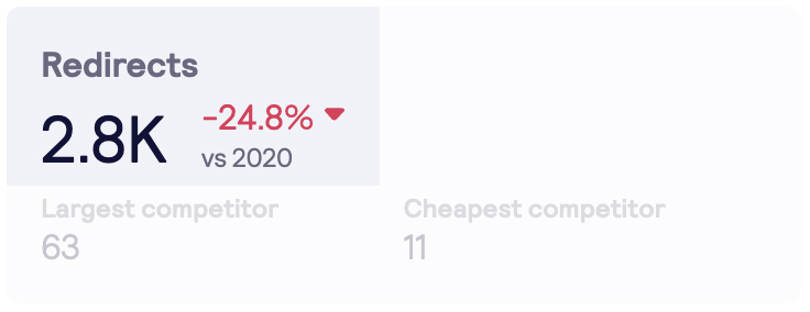
Displays the subscribed airlines' total number of redirects for the selected route and travel month(s), based on travellers' redirects made in the last 12 months. Any percentage change in the average fare per passenger from last year displays as an increase or decrease and is represented by an up or down arrow and colour. Red symbolises a decrease and green, an increase. |
 |
|
|
|
||
|
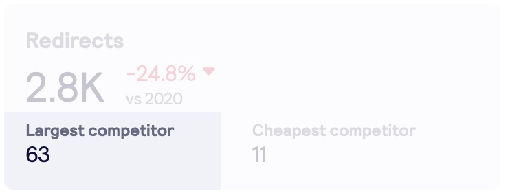
Largest Competitor displays the highest total number of redirects received by a competitor airline. |
 |
|
|
|
||
|
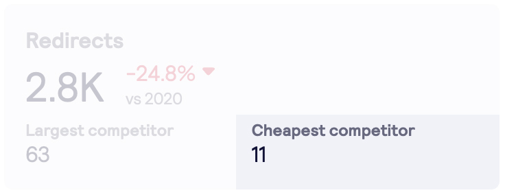
Cheapest Competitor displays the total number of redirects received by the cheapest competitor airline. Please note: a '-' symbol represents cases when the subscribed airline was the cheapest on a route or when there are no competing airlines. |
 |
Fare Comparison set against Market Share
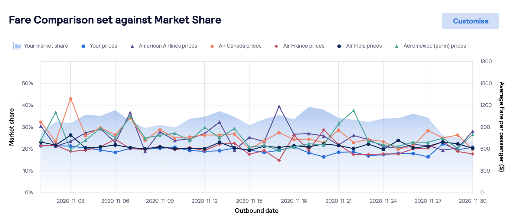
The graph displays the subscribed airlines' market share and its average fare per passenger compared to competitor airlines for a selected travel period.
- Left Y-axis: the blue area represents the subscribed airlines' market share (%) compared to the rest of the market.
- Right Y-Axis: the line graphs represent the subscribed airlines' average fare per passenger versus the top 5 competing airlines.
- Hover over a single data point on the graph to display the exact value of the subscribed airlines' market share and its average fare per passenger versus the competing airlines.
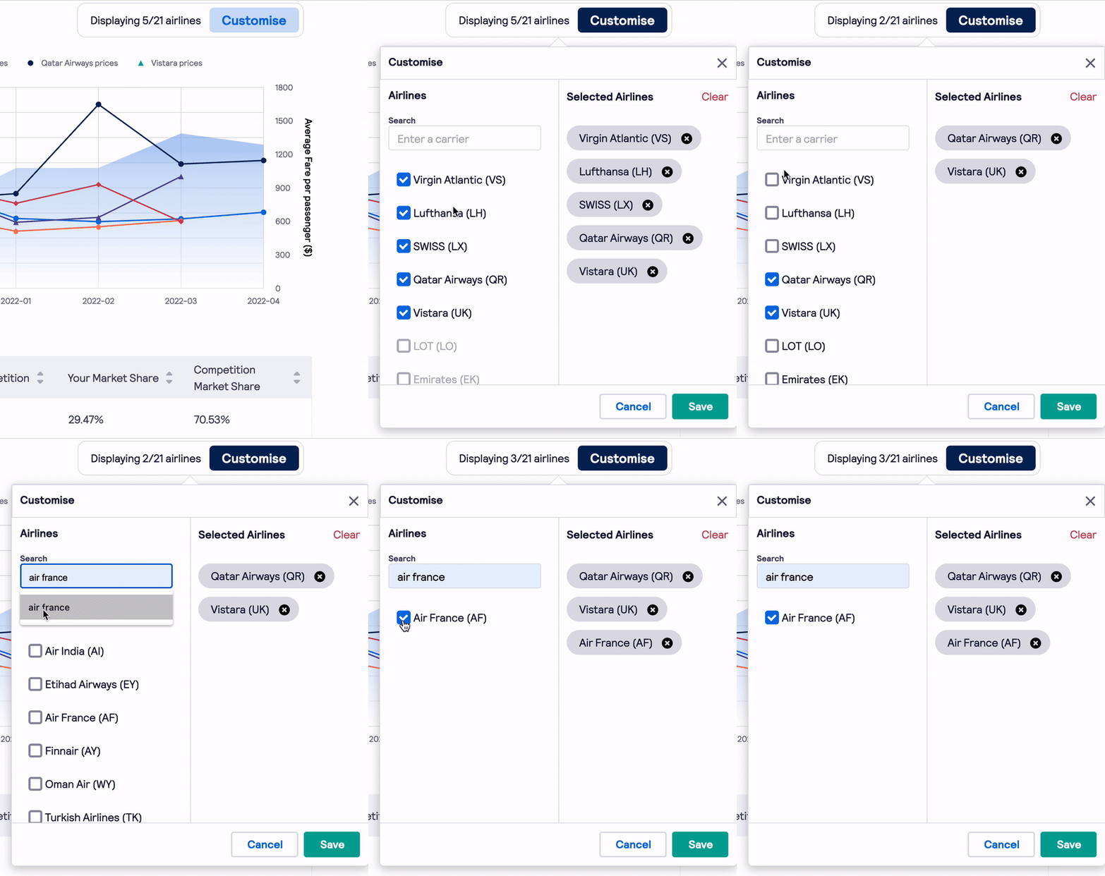
- Click the customise button to compare up to 5 other competing airlines.
Table data
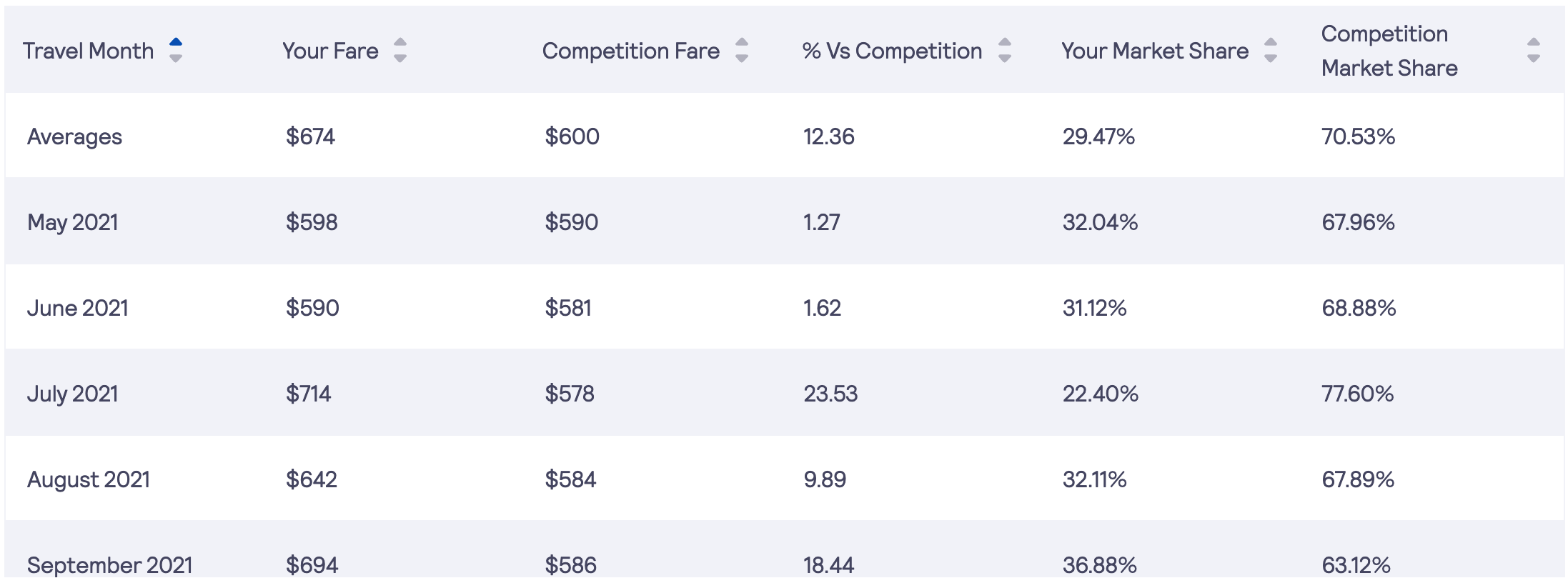
The table displays the subscribed airlines' average fare per passenger, its market share as well as the competition's fares and market share.
- Travel Month: displays travel months of the rolling 12 months period.
- Your Fare: shows the subscribed airlines' average fare per passenger for a given travel month.
- Competition Fare: shows an average fare per passenger of all competing airlines presented on a route for a given travel month.
- % vs Competition: a % difference between the subscribed airlines' fare competing airlines.
- Your Market Share: displays the subscribed airline's market share for a given travel month based on redirects.
- Competition Fare: shows a market share of all competing airlines presented on a route for a given travel month based on redirects.
Please note, that unlike the graph above, which displays only 5 competing airlines at a time, all competing airlines are taken into account in table calculations.
Export
| Both Evolution and Competitiveness modules can be exported in .xls format. |  |
